
Published: July 18, 2026 | Last Updated: June 2, 2026
A website can look perfectly normal and still be difficult to use if you cannot reach or operate its controls reliably with a keyboard. This matters not only to people who regularly use a keyboard instead of a mouse, but also to anyone who encounters a broken touchpad, limited mobility, a temporary injury, or a situation where precise pointer movement is inconvenient. A page may contain all the right information, yet become frustrating when the user cannot move through links, buttons, menus, forms, or dialogs predictably.
Keyboard accessibility is often easiest to understand by using the website without the mouse. On a typical desktop browser, pressing Tab should move the focus to the next interactive element, while Shift + Tab moves backward. Enter generally activates links and buttons, and other controls may have their own expected keyboard behavior. When this sequence breaks, users can become trapped in one part of the page, lose track of where they are, or reach a control that cannot actually be operated.
The problem is not always that a developer deliberately made a website inaccessible. Small interface changes can introduce keyboard problems without being obvious during normal testing. A custom dropdown may respond only to pointer clicks, a modal may allow focus to escape behind it, or a visually obvious button may not receive keyboard focus at all. Understanding these patterns makes it much easier to identify accessibility problems and fix them without unnecessarily redesigning an entire website.
What Keyboard Navigation Should Feel Like
A keyboard-friendly website should provide a clear path through its interactive content. As you press Tab, focus should move in an order that broadly follows the structure of the page, and the currently focused element should be visually identifiable. You should not have to guess whether the browser moved to a hidden element, a control outside the visible area, or something that cannot actually be used.
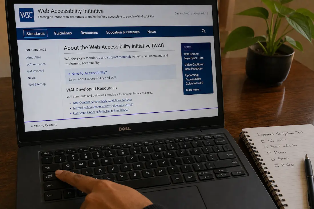
A simple test can reveal a surprising amount. Open a page, place your hands on the keyboard, and press Tab repeatedly without using the mouse. Watch where the focus indicator appears. Can you reach the main navigation? Can you open a menu? Can you reach the search field, buttons, form controls, and important links? If a dialog appears, can you move through its controls and close it without reaching for the mouse?
A useful first-pass check
Try the following on the page you are testing:
- Press Tab several times and observe the focus order.
- Use Shift + Tab to move backward.
- Press Enter on links and appropriate controls.
- Look for a visible focus indicator.
- Check whether menus and dialogs can be operated without a pointer.
- Pay attention to whether focus suddenly jumps somewhere unexpected.
This is not a complete accessibility audit. It is a practical way to discover problems that ordinary mouse-based testing can completely miss.
When the Focus Indicator Disappears
One of the most important parts of keyboard navigation is knowing where the focus currently is. Browsers normally provide a visual indication when an interactive element receives keyboard focus, although websites can alter or remove that appearance through CSS.
If the focus outline has been removed without providing an equally clear replacement, keyboard users may continue pressing Tab without knowing which element is selected. The website may technically respond to the keyboard while still being extremely difficult to navigate because the user’s position is invisible.
A focus indicator should be noticeable against the surrounding content and should remain visible when the element receives keyboard focus. It does not have to use the browser’s default outline, but replacing the default indicator with a subtle effect that is barely visible can create another accessibility problem.
Don’t judge focus only by appearance
A focused element can sometimes be partially hidden because of sticky headers, scrolling containers, animations, or other layout behavior. If the focus indicator exists but the element moves underneath another part of the interface, the user can still lose track of where they are.
This is particularly important on pages with fixed navigation bars. A link may receive focus correctly, but the browser can scroll it beneath a fixed header where the user cannot see it. The keyboard sequence technically works, yet the experience becomes confusing.
The Tab Order Does Not Always Match the Page
The order in which elements receive keyboard focus should make sense to someone moving through the page. When focus jumps from the header to an unrelated sidebar, then back to the middle of the page, the user has to reconstruct the page structure mentally.
Poor focus order can happen when interactive elements are positioned visually with CSS in a way that differs substantially from their underlying document order. It can also occur when developers manually assign positive tabindex values to elements in an attempt to control navigation.
In most cases, relying on the natural document order is easier to maintain. Native links, buttons, form fields and other interactive controls already participate in keyboard navigation without requiring developers to create a custom sequence.
Why manually forcing the order can backfire
Imagine a page with a navigation menu, article content, a search box and a footer. If several elements are given arbitrary positive tabindex values, a future change to the page can make the sequence difficult to predict. One developer may add a new control without realizing that its position interacts with the manually assigned values.
A better approach is usually to organize the HTML so that its logical reading and interaction order matches the intended visual structure. CSS can then handle presentation without forcing keyboard users through an artificial route.
Some Controls Look Interactive but Aren’t
A common accessibility problem occurs when ordinary elements are made to behave like buttons through JavaScript. A <div> or <span> might be given a click handler and styled to look exactly like a button, but appearance alone does not automatically provide the keyboard behavior expected from a real button.
Native HTML controls carry useful behavior with them. A real button can receive keyboard focus and has established interaction semantics. A link behaves like a link. A checkbox behaves like a checkbox. Replacing these native elements with generic containers often creates extra accessibility work and increases the chance that something will be missed.
This is one reason accessibility problems are not always solved by adding a single keyboard event listener. A custom control may need focus behavior, keyboard interaction, appropriate semantics, state information and visible feedback. Whenever possible, using the native HTML element that already represents the intended control is the simpler solution.
Menus Can Be Especially Difficult
Navigation menus are a frequent source of keyboard problems because they often combine several behaviors. A menu may open when someone hovers over it, but keyboard users cannot hover. Another menu may open when its parent link receives focus but close unexpectedly before the user can reach its submenu items.
Consider a navigation bar with a category such as “Services” that reveals several links when clicked or hovered. A mouse user can move the pointer across the menu without thinking about the interaction model. A keyboard user needs a predictable way to reach the category, open the submenu when appropriate, move through its items, and leave the menu without becoming trapped.
Not every website needs a complicated custom keyboard menu system. A straightforward navigation structure using real links can often be much easier to operate. The more complex the menu behavior becomes, the more carefully it needs to be tested with actual keyboard interaction.
Modals and Pop-Ups Can Trap or Lose Focus
Cookie notices, login dialogs, search overlays, newsletter forms and other pop-ups can create another class of keyboard problems. When a dialog opens, the user’s focus should move to an appropriate place inside it so they know that something changed.
The opposite problem can be just as confusing. If the dialog opens visually but keyboard focus remains behind it, pressing Tab may move through controls that the user cannot see or interact with. The user may hear or observe focus changes without understanding why the visible dialog is being ignored.
A properly implemented dialog should also have a predictable way to close and should handle focus appropriately when it disappears. After closing a temporary dialog, returning focus to the control that opened it often provides a much clearer experience than leaving focus somewhere unrelated on the page.
Test overlays separately from ordinary pages
Don’t assume that a page that passes a basic Tab test remains accessible after opening its search box, login window, cookie banner or other overlay.
Open each important temporary interface and test it from the keyboard. Ask three questions:
- Can I reach the controls inside it?
- Can I operate and close it without a mouse?
- Where does focus go when it closes?
These simple checks can expose problems that remain hidden during normal visual testing.
Forms Need More Than Keyboard-Accessible Fields
A form can allow you to Tab through every field and still be difficult to use. Labels, instructions, error messages and validation feedback all influence whether the keyboard experience is understandable.
For example, suppose a form contains an email field that accepts keyboard focus but has no visible or programmatically associated label. The field may be technically reachable, yet a user may not know what information belongs there. Similarly, if submitting the form produces an error message that appears visually but focus remains somewhere else, the user may not realize that action is required.
Form controls should therefore be tested as a complete interaction rather than as isolated focusable objects. Enter information, trigger validation, correct an error, submit the form and observe what happens to focus. If something goes wrong, the user should be able to determine what needs attention without searching the page manually.
Keyboard Shortcuts Can Cause Their Own Problems
Some websites provide keyboard shortcuts for power users. These can be useful, but they can also interfere with normal interaction if they are implemented carelessly.
For example, a website might assign a letter key to open a search function. If that shortcut activates while someone is typing inside a text field, it can interrupt normal input. Similarly, shortcuts that override standard browser behavior can make the website harder to use for people who already rely on familiar keyboard commands.
Keyboard accessibility does not mean adding as many shortcuts as possible. The goal is predictable interaction. When custom shortcuts are genuinely useful, they should be designed so they do not interfere with ordinary text entry and should not create unexpected actions for users who did not intentionally invoke them.
Scrolling and Keyboard Focus Can Get Out of Sync
Long pages and complex layouts can create situations where keyboard focus moves correctly but the user’s view does not provide enough context. This can happen inside scrollable panels, tables, carousels or other components that have their own scrolling behavior.
A user may press Tab and technically move to the next control, while that control is located inside a container that has not scrolled into view. If the browser or interface does not make the focused element visible, the user can easily assume that the keyboard has stopped working.
This is particularly worth testing on pages with nested scrolling areas. A page may have a normal vertical scrollbar while a sidebar, dialog or content panel has another independent scrolling region. Keyboard users should not have to guess which area currently owns the focus.
Keyboard Accessibility Can Break After Interface Changes
A website does not have to be completely redesigned to develop keyboard problems. A small interface update can introduce them.
Replacing a native button with a custom component, changing the navigation structure, adding a sticky header, introducing an animated modal, or modifying CSS focus styles can all affect keyboard behavior. This is why accessibility testing is useful after significant interface changes rather than only when a website is first launched.
The problem can be especially difficult to notice when the development team primarily tests with a mouse. A pointer can move directly to almost any visible element, while keyboard navigation exposes the underlying order and interaction logic of the page.
Test the changes that affect interaction
After changing an interface, revisit the elements most likely to be affected:
| Interface change | What to test |
|---|---|
| New navigation menu | Focus order, opening, submenu access and closing |
| New modal | Initial focus, keyboard operation and focus restoration |
| Custom button | Focus, activation and visible state |
| Form redesign | Labels, errors and submission flow |
| Sticky header | Whether focused content remains visible |
| New pop-up | Keyboard access and reliable closing |
| Custom tabs | Moving between tabs and associated content |
| New carousel | Reaching controls and understanding the current item |
The point is not to create a huge testing checklist for every small CSS adjustment. It is to recognize that changes affecting interaction deserve keyboard testing even when they look harmless.
What to Do When You Find a Keyboard Problem
The best fix depends on what is actually causing the failure. If a button cannot receive focus because it was built from a generic element, replacing it with a native button may be the most appropriate solution. If the focus indicator is missing, restoring a clear focus style may address the immediate problem.
If focus order is confusing, examine the underlying document structure before adding manual tabindex values. If a modal allows focus to escape behind it, review its focus-management behavior. If a menu depends entirely on hover, reconsider how the interaction works when the pointer is unavailable.
Avoid trying to solve every keyboard problem with JavaScript. Native browser behavior and semantic HTML already provide a substantial foundation. The more the interface relies on custom interaction code, the more responsibility falls on the developer to reproduce the behavior users already expect.
A Practical Keyboard Test for a Website
You do not need specialized software to perform a useful first test. Open the website in a desktop browser and start with the mouse completely out of the process. Use Tab from the top of the page and observe each focus transition.
Try to reach the main navigation, search, primary content links, forms and important actions. If a menu opens, attempt to use it. If a dialog appears, operate it and close it. Use Shift + Tab to make sure moving backward does not produce a completely different or confusing sequence.
Then repeat the test on a few important pages rather than assuming one page represents the entire website. A homepage may have simple navigation while a checkout page, account dashboard or content editor contains much more complicated interaction.
Keep a simple record of what fails
For each problem, record the element, action, and result. For example:
“On the account page, pressing Tab reaches the Sign In button, but pressing Enter does nothing.”
That is much more useful to a developer than:
“Keyboard navigation is broken.”
The more precisely the problem is described, the easier it becomes to reproduce and fix without changing unrelated parts of the website.
Don’t Forget Mobile Devices and Touchscreen Users
While this article focuses primarily on keyboard accessibility, the underlying principle is broader: interfaces should not rely too heavily on a single method of interaction.
Users of physical keyboards may have different needs than users of touchscreens, switches, or other assistive technologies. Furthermore, buttons that are small, ambiguous, or rely on hover states can hinder usability beyond just keyboard navigation.
Therefore, simple controls, predictable states, sufficiently large target areas, and easily understandable feedback are often essential for accessible interface design. Instead of developing separate website versions for specific user groups, it is better to improve the underlying interaction patterns to benefit a wider range of users simultaneously.
When the Real Problem isn’t the Browser or the Device
If keyboard navigation works fine on most websites but fails on one specific site, that is a useful clue. The issue does not necessarily lie with the browser or even the keyboard itself.
Try opening the same website in different browsers and, if possible, access other pages on that site. If a specific component consistently fails to work while other websites function correctly, the website’s implementation needs to be investigated. If multiple, unrelated websites exhibit keyboard-related issues, a broader check of the operating system, browser settings, keyboard hardware, or assistive technologies is required.
This comparative approach helps avoid a common mistake: altering device settings when the actual problem lies with a specific website component.
Good Keyboard Navigation is All About Predictability
Simply changing the on-screen content when the Tab key is pressed does not make a website keyboard-friendly. Users need to know their location, navigate between controls in a logical order, perform actions, and exit temporary interfaces like menus and dialog boxes.
One of the simplest and most effective initial tests is to forget about the mouse and try to perform a routine task using only the keyboard. Open the navigation, find a page, fill out a form, perform an action, and close any pop-ups. Pay attention to moments where you hesitate or feel the need to use the mouse to proceed.
These moments provide excellent evidence. They can highlight a lack of user focus, inaccessible controls, cluttered tabs, faulty menus, poorly organized dialog boxes, and other interface issues that standard visual tests might overlook. Addressing these potential problems makes your website more predictable—benefiting not only keyboard users but anyone who relies on clear, user-friendly interactions.
Frequently Asked Questions
Why are some buttons inaccessible via the Tab key?
The button might not be a native interactive element, might have been removed from the standard focus order, or might have an incorrect focus setting. Custom controls created from generic HTML elements are particularly important to test, as they require more keyboard input to function correctly.
How can I hide keyboard focus on a website?
The website may have disabled the browser’s default focus outline or changed it to a style that is visually illegible. Keyboard users need a clear indication of which interactive element currently has focus; removing the focus indicator without providing a suitable alternative makes navigation very difficult.
Why does the Tab key behave strangely on a website?
Focus typically follows the document structure, but CSS positioning, dynamically inserted elements, and explicitly set `tabindex` values can create a discrepancy between the visual order and the keyboard navigation order. Maintaining a logical document structure is generally much simpler than manually enforcing complex tab sequences.
Does using JavaScript mean a website isn’t accessible via the keyboard?
Yes. The issue lies not with JavaScript itself, but with the implementation of interactive behavior. If a JavaScript component supports proper focus behavior, keyboard interaction, semantics, and visual feedback, it can also provide keyboard-friendly access.
Why can pop-ups be operated with a mouse but not with a keyboard?
Pop-ups may be designed for mouse interaction but fail to handle keyboard focus correctly. When a pop-up opens, focus might remain trapped behind an overlay, or the controls within the pop-up might be inaccessible. By using the Tab key and other relevant keys, you can detect errors in the sequence of opening, interaction, and closing.

ClarityTechHub Editorial Team publishes practical technology guides covering device compatibility, accessibility, home technology, maintenance, and technology setup. Our articles focus on explaining everyday technology problems clearly, comparing practical solutions, and helping readers make informed decisions about the devices and systems they use.