
Published: July 13, 2026 | Last Updated: June 2, 2026
An app can be perfectly functional and still be uncomfortable to use when its text, buttons, menus, and other interface elements are too small. This becomes especially noticeable when reading messages, checking account details, browsing settings, or working through a form for several minutes at a time. Increasing the text size can help, but simply making everything larger does not always produce a better result. Some apps respond well to larger display settings, while others may rearrange their interface, truncate labels, or leave controls awkwardly positioned.
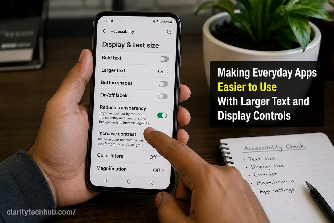
The useful approach is to treat larger text and display controls as accessibility tools rather than emergency fixes. Modern phones and computers provide several ways to change text size, display scaling, zoom, contrast, and related settings. These controls can make everyday applications considerably easier to read and navigate without requiring the user to permanently change the device or replace an app.
The challenge is finding a comfortable balance. Text should be large enough to read without strain, while menus and controls should remain visible and usable. If increasing the size of content causes an app to become crowded, the solution may involve adjusting a different display setting, changing the app’s own text preferences, rotating the screen, or using a device-level accessibility option designed for that purpose.
Start With the Problem You Are Actually Trying to Fix
Before changing display settings, identify what feels difficult. Someone may have trouble reading small text but have no difficulty pressing buttons. Another person may be able to read the text but find icons and controls too small to select accurately. Someone else may need larger text only in certain applications.
These differences matter because phones and computers often provide several independent controls. Text size, display scaling, magnification, zoom, and screen resolution are not necessarily the same thing. Changing the wrong one can make an interface less comfortable without addressing the original problem.
For example, increasing display scaling may enlarge text and controls together, while changing an app’s font-size setting might affect only written content. A browser’s zoom control can enlarge a webpage without changing the size of the entire operating system interface. Knowing which part of the display needs attention helps you choose the least disruptive solution.
Identify what is hardest to see
Try to determine whether the problem occurs with:
- Small text in messages or articles
- Labels inside menus and settings
- Buttons and interactive controls
- Icons that are difficult to distinguish
- Text fields and form instructions
- Notifications or status information
- Content inside a browser
- One particular application
If only one app is difficult to read, changing the entire device’s display settings may be unnecessary. Look first for a text-size or accessibility option within that application.
Use the App’s Own Text Settings First When Available
Some applications provide their own controls for text size, appearance, or readability. These settings can be useful because they may change the content without affecting the rest of the device.
A messaging application, reading app, email client, or browser may offer several text-size choices. If the application provides such an option, it is often worth trying before changing system-wide display settings.
This approach also gives you more control. You might prefer larger text in an app used for reading but want the rest of the device to remain at its normal size. App-specific controls can accommodate that preference without changing every menu, icon, and notification on the device.
However, not every app offers this flexibility. Some applications rely almost entirely on the operating system’s display settings, while others may have limited support for larger text.
When Device-Level Text Size Makes More Sense
If small text is a problem across many applications, adjusting the device’s text-size or accessibility settings can be more practical. A system-level change can improve readability across supported apps instead of requiring you to configure each one separately.
On a phone, this may affect areas such as settings menus, messages, labels, notifications, and other interface text. On a computer, display scaling or text-related accessibility settings can serve a similar purpose.
The exact names and locations of these controls vary between operating systems and device manufacturers, so avoid assuming that every phone uses the same menu structure. Look for settings related to Accessibility, Display, Text Size, Font Size, Display Size, or Scaling.
Increase the setting gradually
You do not necessarily need to choose the largest available option. Start with a moderate increase and use the device normally for a while.
Read a long message, open a settings page, type into a form, browse a website, and switch between several apps. This reveals problems that may not be obvious when looking at the settings screen itself.
If the text becomes comfortable to read but buttons or menus become difficult to use, the display setting may need further adjustment rather than simply being increased again.
Text Size and Display Size Solve Different Problems
This distinction is important because the two settings can produce noticeably different results.
Text size generally focuses on written content. It can make letters and words easier to read without necessarily enlarging every visual element on the screen.
Display size or scaling generally changes the overall size of interface elements. Depending on the operating system, this can make icons, controls, menus, and text larger together.
Neither option is universally better. If you can read the interface but struggle to tap small controls, increasing display size may be more useful. If the controls are already comfortable but written content is too small, increasing text size may be the better choice.
| What feels difficult | Setting worth trying first |
|---|---|
| Articles and messages are too small | Text size |
| Icons and controls are difficult to tap | Display size or scaling |
| One website is too small | Browser zoom |
| One app is difficult to read | App-specific text setting |
| The entire screen feels cramped | Display scaling or layout options |
| You need temporary close-up viewing | Magnification or zoom |
These are starting points rather than strict rules. Different operating systems and applications implement their settings differently.
Larger Text Can Expose Poor App Design
An application may look fine at its default settings but become difficult to use when text is enlarged. Labels can be cut off, buttons can overlap, menus can become cramped, and important information can disappear.
That does not necessarily mean the larger text setting is causing the problem. It can reveal that the application’s interface was not designed to accommodate users who need larger content.
For example, imagine a settings screen where every option is displayed in a fixed-height box. At the default text size, the labels fit comfortably. After increasing the text size, several labels wrap onto a second line but the boxes remain the same height. The result may be clipped text or overlapping content.
This is particularly frustrating because the accessibility setting is doing exactly what the user requested, while the application is failing to adapt to the larger content.
Watch for these changes after increasing text
After adjusting text or display size, check whether:
- Text is cut off at the edge of a button.
- Menu labels disappear or become incomplete.
- Buttons overlap each other.
- Important controls move off-screen.
- Dialog boxes become difficult to close.
- Long titles are replaced by unexplained symbols or ellipses.
- Forms require excessive scrolling.
- Text becomes larger but remains difficult to distinguish from its background.
If these problems occur in only one application, the issue may be specific to that app rather than the device.
Don’t Forget Browser Zoom
Many everyday tasks now happen inside a web browser rather than a dedicated application. Websites can therefore become much easier to use simply by increasing the browser’s page zoom.
This is particularly useful when a website uses small text but the rest of your computer’s interface is already comfortable. Browser zoom can enlarge webpage content without changing the size of unrelated operating-system elements.
It can also be useful temporarily. You might increase the zoom while reading a long article and return it to normal afterward. This is different from changing the computer’s overall display scaling.
If increasing browser zoom causes a website’s layout to become crowded, check whether the page responds well to the larger size. A well-designed responsive website should adapt reasonably to different viewing sizes, although not every site does.
Larger Text Does Not Automatically Mean Better Contrast
Increasing the size of text can make reading easier, but size is only one part of visual accessibility. Pale text, complicated backgrounds, thin fonts, and poor separation between foreground and background can still make content difficult to read.
For example, enlarging light-gray text on a white background may make the letters bigger without making them substantially easier to distinguish.
When text remains difficult to read after increasing its size, consider whether contrast, font weight, brightness, or the surrounding visual design is contributing to the problem. Many devices also provide accessibility options related to contrast or visual appearance that can complement larger text.
The goal is not simply to make letters bigger. It is to make the information clear and comfortable to perceive.
Magnification Is Useful When You Don’t Need Everything Larger
Some people do not need permanently enlarged text. They may only have difficulty with occasional small details, such as a particular image, map, dialog box, or part of a webpage.
In that situation, magnification can be more convenient than changing the entire interface. Depending on the device, accessibility magnification may allow you to temporarily enlarge a portion of the screen and then return to the normal view.
This can be especially helpful when a larger system-wide layout would create too much scrolling or cause other applications to become cramped.
Think of magnification as a targeted tool rather than a replacement for appropriate text sizing. If you consistently struggle with small text throughout the day, a comfortable default text size may be more useful.
Larger Text Can Change How You Navigate an App
One overlooked consequence of increasing text size is that more content may fit on a single screen at the default setting than at the enlarged setting. A page that previously displayed ten options might display only six.
That is not necessarily a problem. More scrolling can be a reasonable trade-off for better readability. Problems arise when an application assumes that all users will see the same amount of content at once.
Pay attention to whether important information becomes difficult to find. A larger display setting should not make basic navigation impossible. If a frequently used function moves several screens deeper into an interface, check whether the app provides a simpler navigation option.
Scrolling is not automatically a failure
It is easy to think that an accessible interface should fit everything onto one screen. That is not realistic for every device or text size.
A longer page with comfortable text can be much easier to use than a compact page filled with tiny content. The objective should be reasonable navigation without sacrificing readability, not eliminating every need to scroll.
Test the Settings With Real Tasks
The settings screen itself is a poor place to decide whether a particular size is comfortable. Use the applications and tasks that matter to you.
Read a message, search for a setting, open a website, type an email, check a calendar appointment, and interact with a form. These ordinary activities reveal whether the new size actually improves your experience.
It is also worth testing both portrait and landscape orientations on devices that support them. A layout that works comfortably in portrait mode may become unnecessarily wide or rearranged when rotated.
Try the device under normal lighting too. An interface that looks comfortable in a dim room may behave differently under bright light or glare.
What If Only One App Becomes Difficult?
If most applications work well after increasing the text size but one particular app becomes unusable, avoid immediately undoing the accessibility setting for the entire device.
First check whether that app has its own appearance, text, accessibility, or display options. Look for an update as well, particularly if the problem appeared after changing the system text size.
If the application consistently clips text, hides controls, or becomes unusable at larger settings, the problem may need to be reported to the developer. Include the device type, operating-system version, app version, the display setting you changed, and what specifically becomes difficult to use.
That information is much more useful than simply reporting that “large text doesn’t work.”
A Practical Way to Find a Comfortable Setup
There is no universal text size that works for everyone. The right setting depends on the device, viewing distance, screen quality, eyesight, preferred layout, and the applications being used.
A useful process is to make one change at a time:
- Increase text size slightly.
- Test the applications you use most.
- Check whether controls remain visible and usable.
- If controls are still too small, test display scaling.
- If only one website is difficult, use browser zoom.
- If occasional details remain too small, try magnification.
- Check contrast if larger text still feels difficult to distinguish.
- Keep the smallest setting that remains comfortable rather than chasing a particular percentage.
The advantage of this approach is that you can identify which setting actually improves your experience. If you change several accessibility controls simultaneously, it becomes harder to know which adjustment helped and which one introduced a new problem.
When Larger Text Makes an App Worse
Sometimes an application simply does not respond well to larger content. You might find that increasing text size makes a menu more readable but pushes an important button below the visible area. Another application might show only half of a label or require excessive horizontal scrolling.
Do not assume that you have to accept the problem because the application is “accessible” at its default setting. If users cannot comfortably read the content at a reasonable enlarged size, the application may have limitations in its layout.
At the same time, don’t immediately conclude that the application is unusable. Look for alternative views, landscape orientation, built-in accessibility options, browser versions of the service, or a simpler interface if one exists.
Consider the Whole Device Experience
Accessibility settings work best when they are considered as part of the overall experience rather than isolated switches. Larger text may solve readability while increasing the need for scrolling. Larger display scaling may make controls easier to tap but reduce the amount of information visible at once. Magnification may solve a specific problem but be inconvenient for constant use.
These are normal trade-offs. The best configuration is the one that makes the tasks you actually perform easier without creating more serious problems elsewhere.
It is also worth remembering that accessibility preferences can change over time. A setting that feels comfortable on one device may not feel the same on another device with a different screen size or pixel density. There is nothing wrong with adjusting the settings when your circumstances change.
The Best Setting Is the One That Makes Everyday Tasks Easier
Larger text and display controls can make a substantial difference to everyday device use, but accessibility is not simply a matter of choosing the biggest available setting. The useful configuration is the one that improves readability while keeping menus, controls, forms, and navigation practical.
Start with the smallest change that addresses the problem. If text alone is difficult, try a text-size adjustment. If icons and controls are also too small, consider display scaling. For individual websites, browser zoom may be enough, while occasional small details may be better handled with magnification.
Most importantly, judge the result by how the device feels during real tasks, not by how the settings page looks. Read a message, complete a form, navigate an unfamiliar menu, and use the applications you depend on. If the changes make those activities more comfortable without introducing new barriers, you have found a setting that is doing what accessibility controls are supposed to do: adapting technology to the person using it.

ClarityTechHub Editorial Team publishes practical technology guides covering device compatibility, accessibility, home technology, maintenance, and technology setup. Our articles focus on explaining everyday technology problems clearly, comparing practical solutions, and helping readers make informed decisions about the devices and systems they use.